- scatter1.py
#######
# This plots 100 random data points (set the seed to 42 to
# obtain the same points we do!) between 1 and 100 in both
# vertical and horizontal directions.
######
import plotly.offline as pyo
import plotly.graph_objs as go
import numpy as np

np.random.seed(42)
random_x = np.random.randint(1,101,100)
random_y = np.random.randint(1,101,100)

data = [go.Scatter(
    x = random_x,
    y = random_y,
    mode = 'markers',
)]

pyo.plot(data, filename='scatter1.html')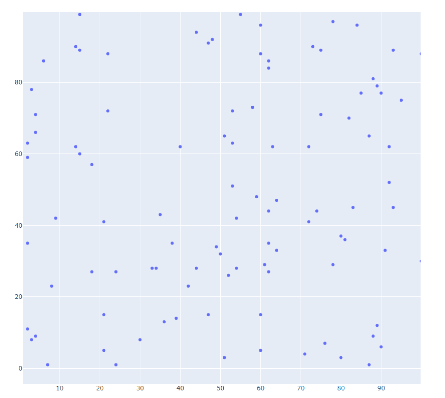
- scatter2.py
#######
# This plots 100 random data points (set the seed to 42 to
# obtain the same points we do!) between 1 and 100 in both
# vertical and horizontal directions.
######
import plotly.offline as pyo
import plotly.graph_objs as go
import numpy as np

np.random.seed(42)
random_x = np.random.randint(1,101,100)
random_y = np.random.randint(1,101,100)

data = [go.Scatter(
    x = random_x,
    y = random_y,
    mode = 'markers',
)]
layout = go.Layout(
    title = '1과 100 사이 난수 Scatterplot', # Graph title
    xaxis = dict(title = 'x-values'), # x-axis label
    yaxis = dict(title = 'y-values'), # y-axis label
    hovermode ='x' # handles multiple points landing on the same vertical
)
fig = go.Figure(data=data, layout=layout)
pyo.plot(fig, filename='scatter2.html')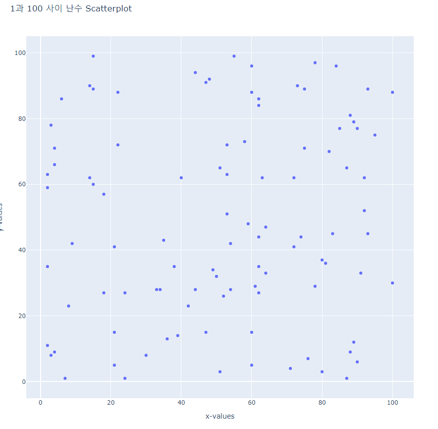
- scatter3.py
#######
# This plots 100 random data points (set the seed to 42 to
# obtain the same points we do!) between 1 and 100 in both
# vertical and horizontal directions.
######
import plotly.offline as pyo
import plotly.graph_objs as go
import numpy as np

np.random.seed(42)
random_x = np.random.randint(1,101,100)
random_y = np.random.randint(1,101,100)

data = [go.Scatter(
    x = random_x,
    y = random_y,
    mode = 'markers',
    marker = dict(      # change the marker style
        size = 12,
        color = 'rgb(51,204,153)',
        symbol = 'pentagon',
        line = dict(
            width = 2,
        )
    )
)]
layout = go.Layout(
    title = '1과 100 사이 난수 Scatterplot', # Graph title
    xaxis = dict(title = 'x-values'), # x-axis label
    yaxis = dict(title = 'y-values'), # y-axis label
    hovermode ='closest' # handles multiple points landing on the same vertical
)
fig = go.Figure(data=data, layout=layout)
pyo.plot(fig, filename='scatter3.html')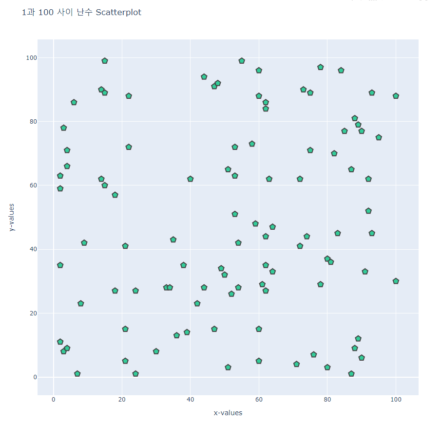
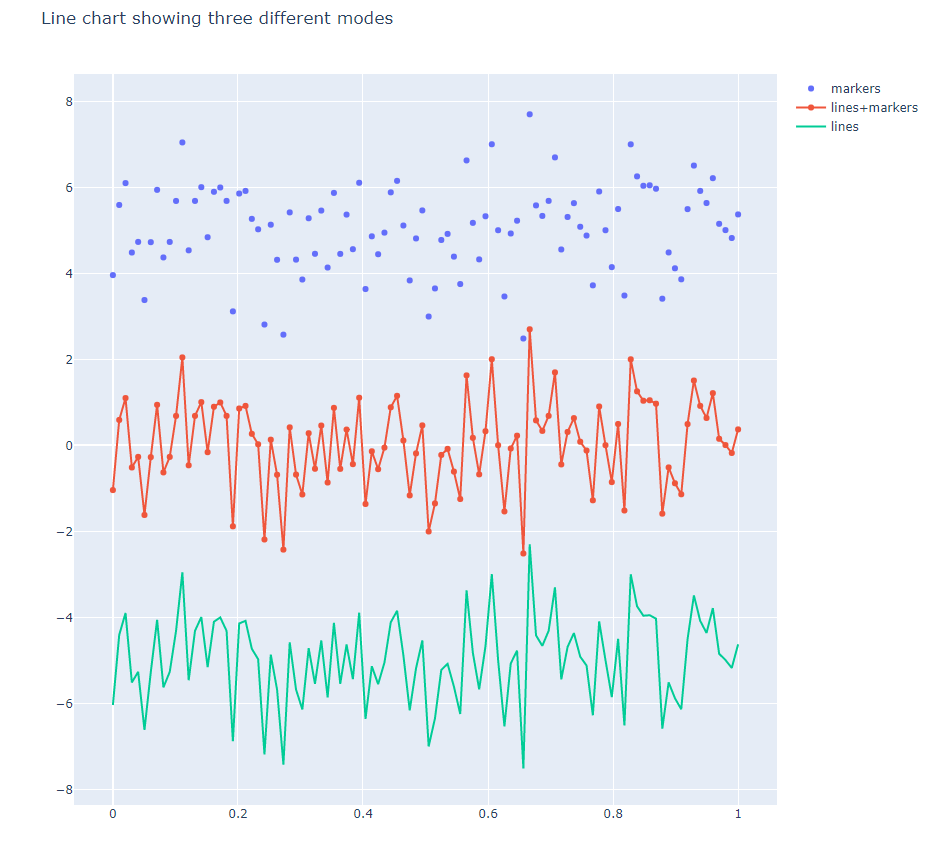
- line1.py
#######
# This line chart displays the same data
# three different ways along the y-axis.
######
import plotly.offline as pyo
import plotly.graph_objs as go
import numpy as np

np.random.seed(56)
x_values = np.linspace(0, 1, 100) # 100 evenly spaced values
y_values = np.random.randn(100)   # 100 random values

# create traces
trace0 = go.Scatter(
    x = x_values,
    y = y_values+5,
    mode = 'markers',
    name = 'markers'
)
trace1 = go.Scatter(
    x = x_values,
    y = y_values,
    mode = 'lines+markers',
    name = 'lines+markers'
)
trace2 = go.Scatter(
    x = x_values,
    y = y_values-5,
    mode = 'lines',
    name = 'lines'
)
data = [trace0, trace1, trace2]  # assign traces to data
layout = go.Layout(
    title = 'Line chart showing three different modes'
)
fig = go.Figure(data=data,layout=layout)
pyo.plot(fig, filename='line1.html')
linespace(0, 1, 100) # 0과 1사이를 100개의 구간으로
- line2.py
import plotly.offline as pyo
import plotly.graph_objs as go
import pandas as pd

# read a .csv file into a pandas DataFrame:
df = pd.read_csv(r'population.csv', index_col=0)

# create traces
traces = [go.Scatter(
    x = df.columns,
    y = df.loc[name],
    mode = 'markers+lines',
    name = name
) for name in df.index]

layout = go.Layout(
    title = 'Population Estimates of the Six New England States'
)

fig = go.Figure(data=traces,layout=layout)
pyo.plot(fig, filename='line2.html')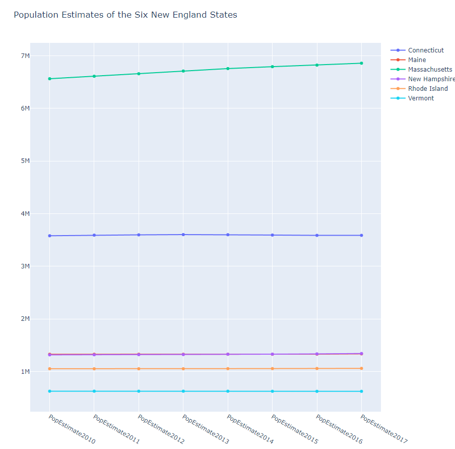
- line3.py
#######
# This line chart shows U.S. Census Bureau
# population data from six New England states.
# THIS PLOT USES PANDAS TO EXTRACT DESIRED DATA FROM THE SOURCE
######
import plotly.offline as pyo
import plotly.graph_objs as go
import pandas as pd

df = pd.read_csv('nst-est2017-alldata.csv')
# Alternatively:
# df = pd.read_csv('https://www2.census.gov/programs-surveys/popest/datasets/2010-2017/national/totals/nst-est2017-alldata.csv')

# grab just the six New England states:
df2 = df[df['DIVISION']=='1']
# set the index to state name:
df2.set_index('NAME', inplace=True)
# grab just the population columns:
df2 = df2[[col for col in df2.columns if col.startswith('POP')]]

traces=[go.Scatter(
    x = df2.columns,
    y = df2.loc[name],
    mode = 'markers+lines',
    name = name
) for name in df2.index]

layout = go.Layout(
    title = 'Population Estimates of the Six New England States'
)

fig = go.Figure(data=traces,layout=layout)
pyo.plot(fig, filename='line3.html')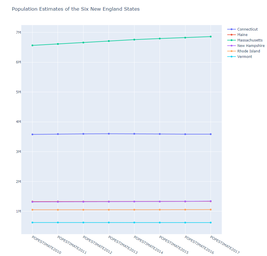
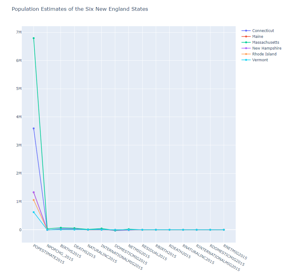
pop -> DEATH 로
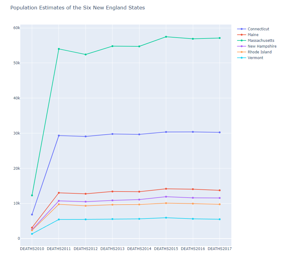
2015년도 자료만
if col.endswith('2015')
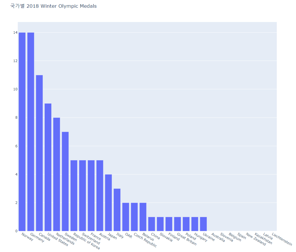
- bar1.py
#######
# A basic bar chart showing the total number of
# 2018 Winter Olympics Medals won by Country.
######
import plotly.offline as pyo
import plotly.graph_objs as go
import pandas as pd

df = pd.read_csv(r'2018WinterOlympics.csv')

data = [go.Bar(
    x=df['NOC'],  # NOC stands for National Olympic Committee
    y=df['Total']
)]
layout = go.Layout(
    title='국가별 2018 Winter Olympic Medals'
)
fig = go.Figure(data=data, layout=layout)
pyo.plot(fig, filename='bar1.html')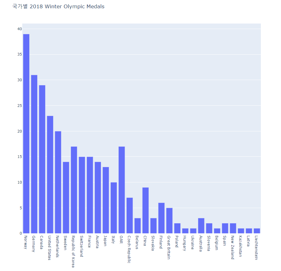
금메달만 Total -> Gold
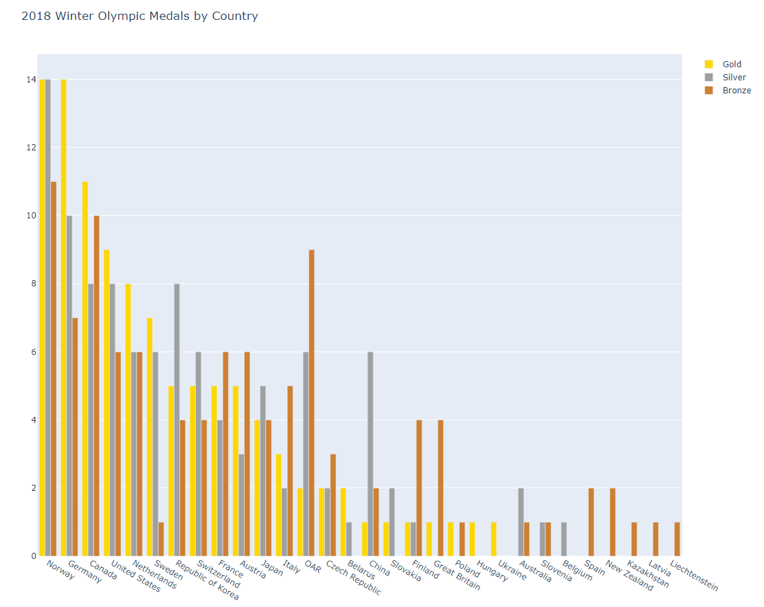
- bar2.py
#######
# This is a grouped bar chart showing three traces
# (gold, silver and bronze medals won) for each country
# that competed in the 2018 Winter Olympics.
######
import plotly.offline as pyo
import plotly.graph_objs as go
import pandas as pd

df = pd.read_csv(r'2018WinterOlympics.csv')

trace1 = go.Bar(
    x=df['NOC'],  # NOC stands for National Olympic Committee
    y=df['Gold'],
    name = 'Gold',
    marker=dict(color='#FFD700') # set the marker color to gold
)
trace2 = go.Bar(
    x=df['NOC'],
    y=df['Silver'],
    name='Silver',
    marker=dict(color='#9EA0A1') # set the marker color to silver
)
trace3 = go.Bar(
    x=df['NOC'],
    y=df['Bronze'],
    name='Bronze',
    marker=dict(color='#CD7F32') # set the marker color to bronze
)
data = [trace1, trace2, trace3]
layout = go.Layout(
    title='2018 Winter Olympic Medals by Country',
    barmode='stack'
)
fig = go.Figure(data=data, layout=layout)
pyo.plot(fig, filename='bar2.html')
barmode = 'stack' 스택형으로 메달 개수 시각화
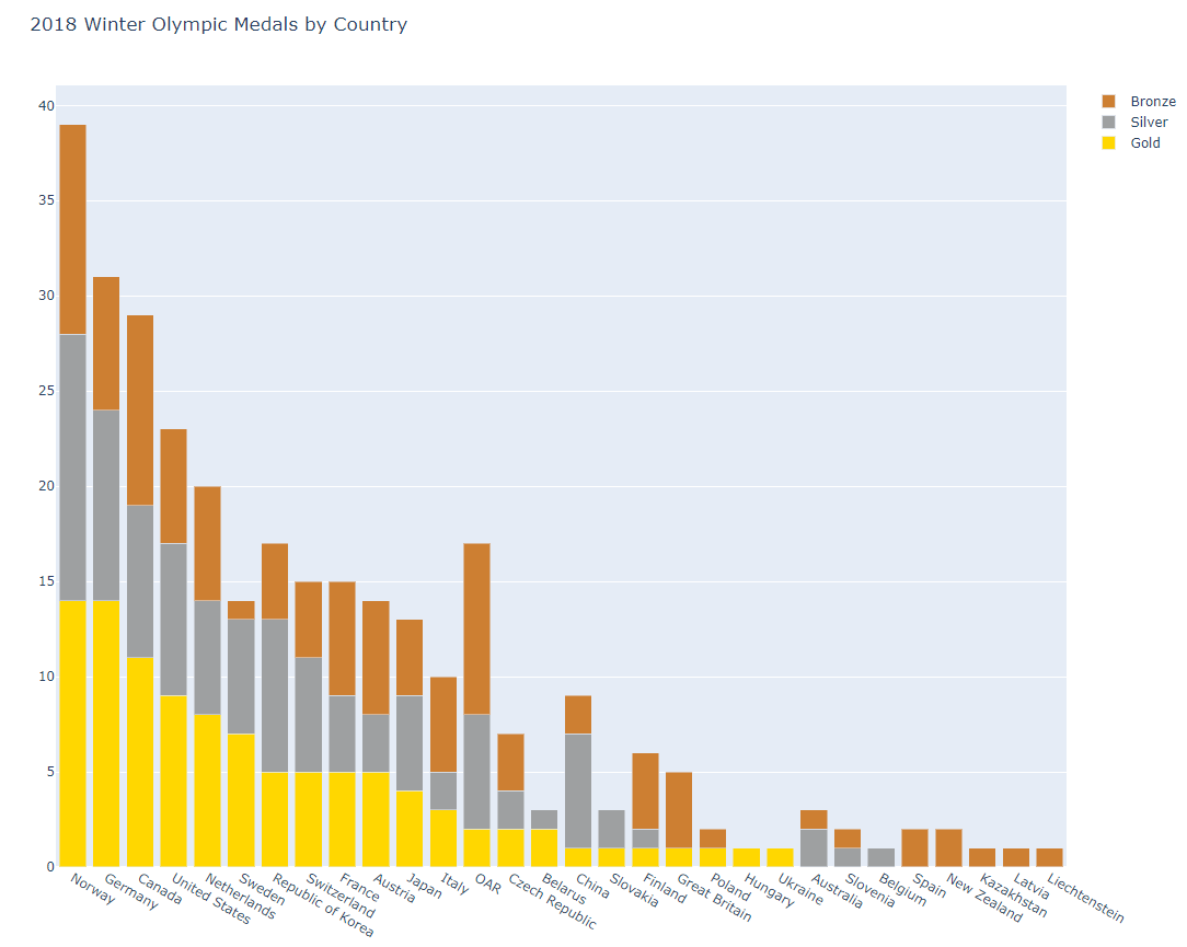
barmode 주석 처리 시
- bubble1.py
#######
# A bubble chart is simply a scatter plot
# with the added feature that the size of the
# marker can be set by the data.
######
import plotly.offline as pyo
import plotly.graph_objs as go
import pandas as pd

df = pd.read_csv(r'mpg.csv')

data = [go.Scatter(          # start with a normal scatter plot
    x=df['horsepower'],
    y=df['mpg'],
    text=df['name'],
    mode='markers',
    marker=dict(size=1.5*df['cylinders']) # set the marker size
)]

layout = go.Layout(
    title='Vehicle mpg vs. horsepower',
    xaxis = dict(title = 'horsepower'), # x-axis label
    yaxis = dict(title = 'mpg'),        # y-axis label
    hovermode='closest'
)
fig = go.Figure(data=data, layout=layout)
pyo.plot(fig, filename='bubble1.html')- mpg = 연비
- 원이 크면 클수록 cylinders 수가 큼
- 연비가 낮을 때 주로 원의 크기가 큼 -> cylinders 수가 큼
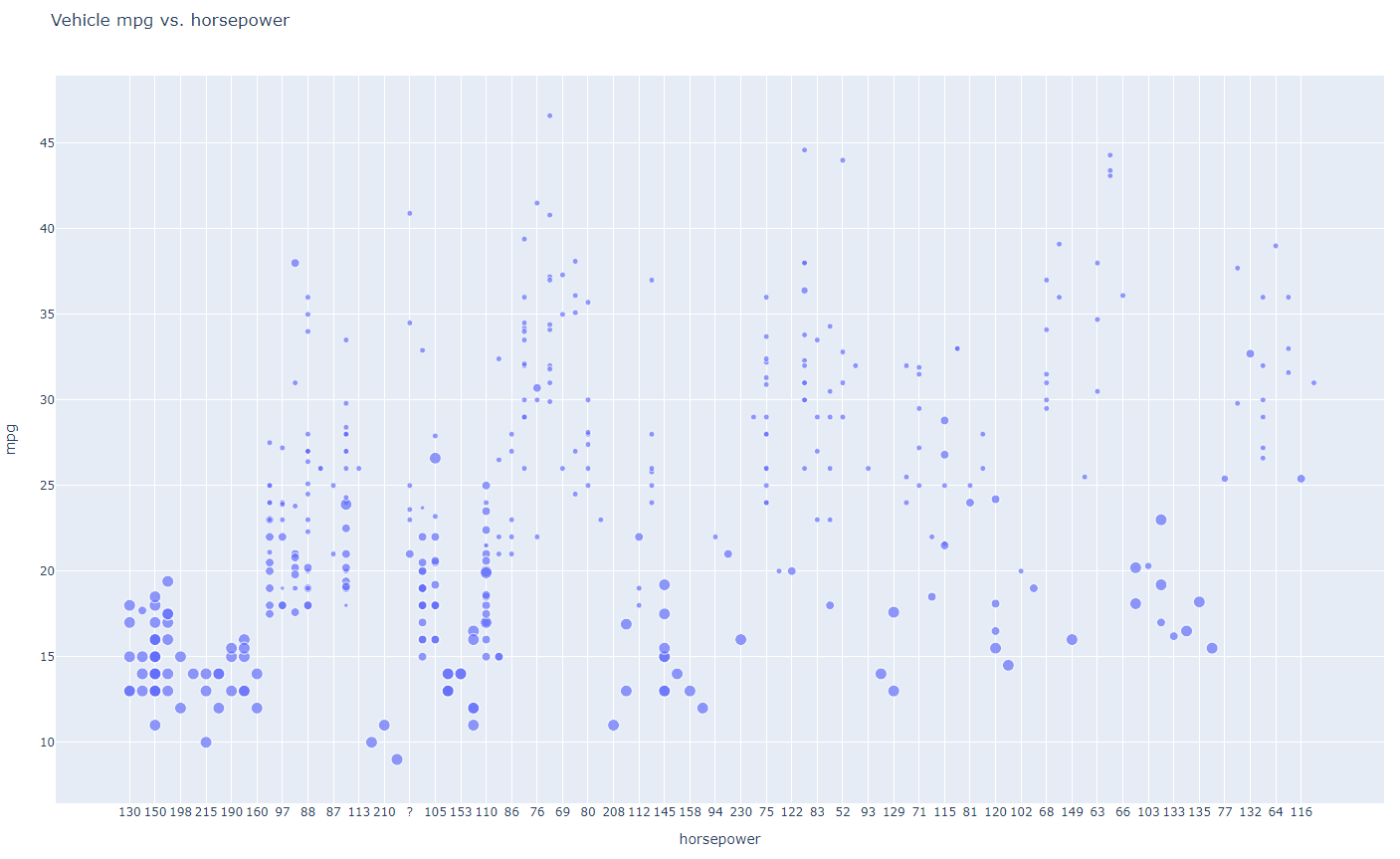
원의 크기 = weight를 기준으로
marker=dict(size=0.005*df['weight'])
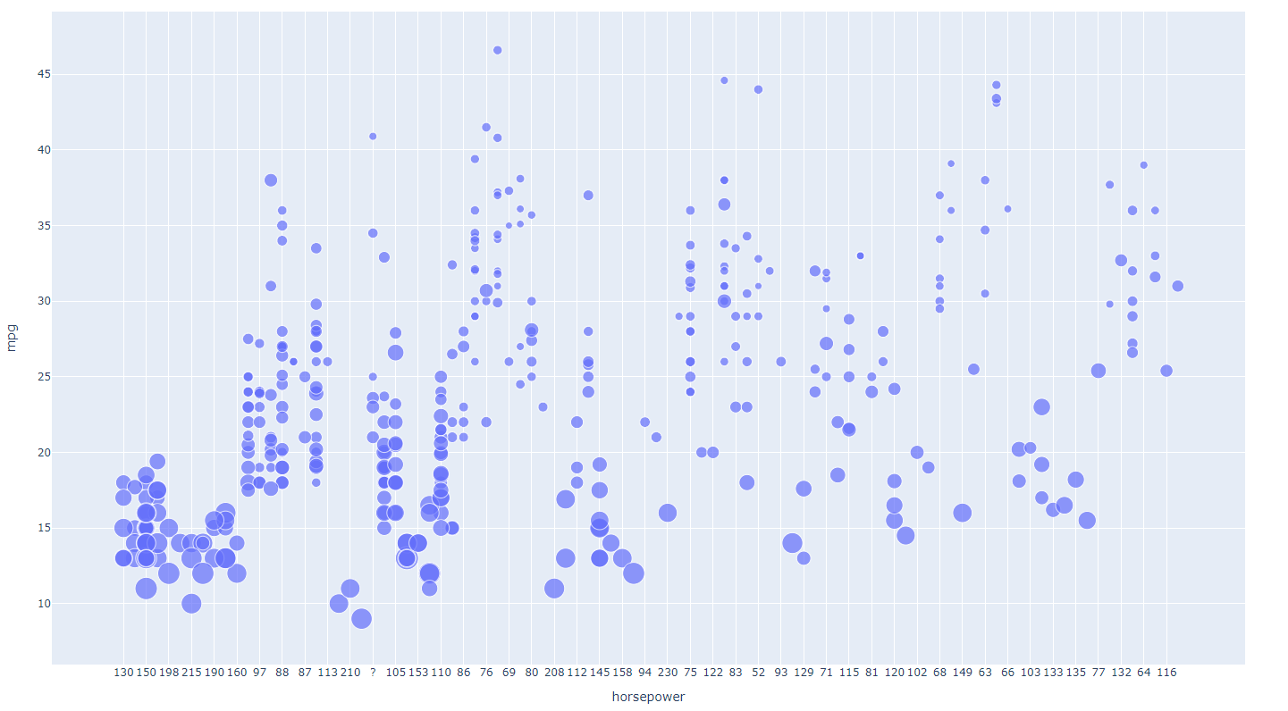
- bubble2.py
#######
# A bubble chart is simply a scatter plot
# with the added feature that the size of the
# marker can be set by the data.
######
import plotly.offline as pyo
import plotly.graph_objs as go
import pandas as pd

df = pd.read_csv(r'mpg.csv')

# Add columns to the DataFrame to convert model year to a string and
# then combine it with name so that hover text shows both:
df['text1']=pd.Series(df['model_year'],dtype=str)
df['text2']="'"+df['text1']+" "+df['name']

data = [go.Scatter(
            x=df['horsepower'],
            y=df['mpg'],
            text=df['text2'],  # use the new column for the hover text
            mode='markers',
            marker=dict(size=2*df['cylinders'])
    )]
layout = go.Layout(
    title='Vehicle mpg vs. horsepower',
    hovermode='closest'
)
fig = go.Figure(data=data, layout=layout)
pyo.plot(fig, filename='bubble2.html')
- box1.py
#######
# This simple box plot places the box beside
# the original data points on the same graph.
######
import plotly.offline as pyo
import plotly.graph_objs as go

# set up an array of 20 data points, with 20 as the median value
y = [1,14,14,15,16,18,18,19,19,20,20,23,24,26,27,27,28,29,33,54]

data = [
    go.Box(
        y=y,
        boxpoints='outliers', # display the original data points
         # offset them to the left of the box
    )
]
pyo.plot(data, filename='box1.html')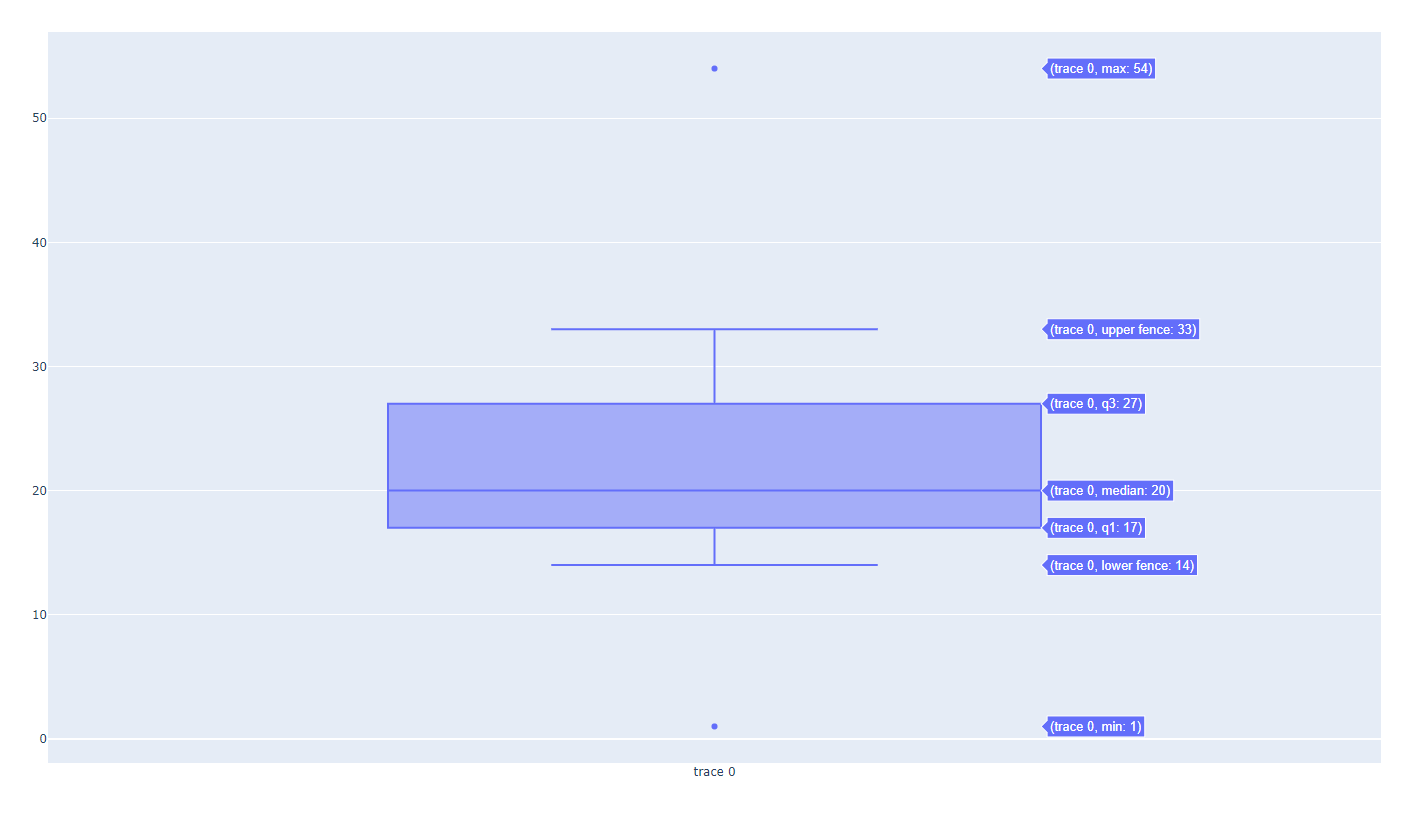
- (median 값 위치를 기준으로), 얇다 = 밀집되어 있다, 두껍다 = 값들이 비교적 떨어져있다
- 이상치 out lier = 측정이 잘못됐거나, 값이 이상하거나
- box3.py
import plotly.offline as pyo
import plotly.graph_objs as go
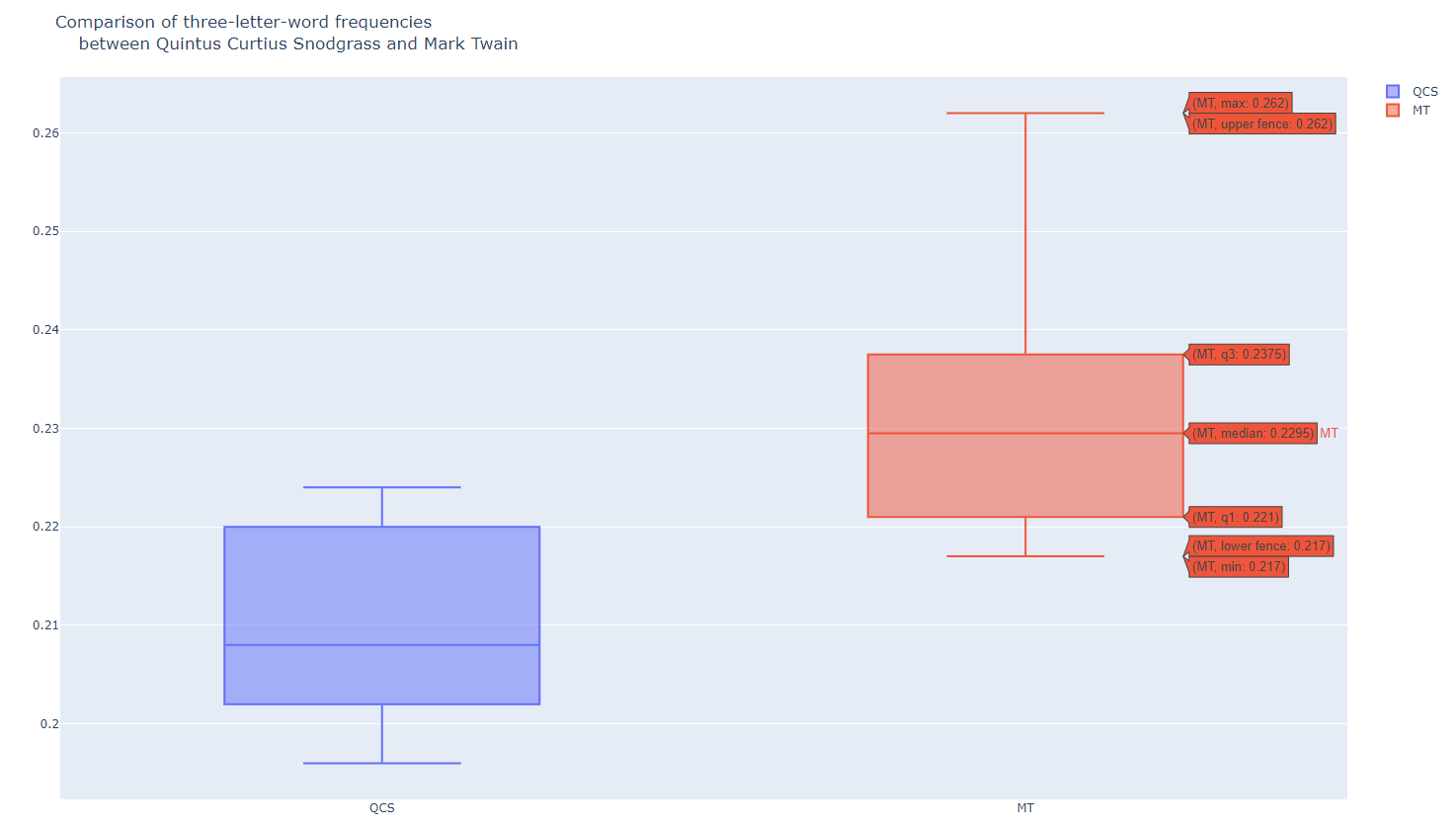
snodgrass = [.209,.205,.196,.210,.202,.207,.224,.223,.220,.201]
twain = [.225,.262,.217,.240,.230,.229,.235,.217]
data = [
go.Box(
y=snodgrass,
name='QCS'
),
go.Box(
y=twain,
name='MT'
)
]
layout = go.Layout(
title = 'Comparison of three-letter-word frequencies<br>\
between Quintus Curtius Snodgrass and Mark Twain'
)
fig = go.Figure(data=data, layout=layout)
pyo.plot(fig, filename='box3.html')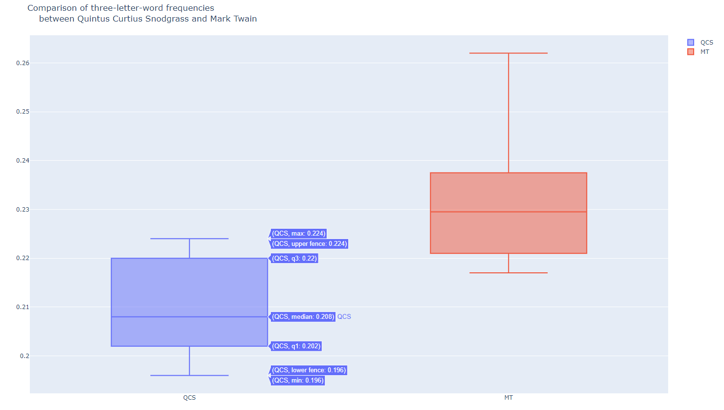
- hist1.py
import plotly.offline as pyo
import plotly.graph_objs as go
import pandas as pd

df = pd.read_csv(r'mpg.csv')

data = [go.Histogram(
    x=df['mpg'],
    xbins=dict(start=8, end=50, size=0.5),
)]   # Histogram : continuous data, BarChart : Discrete data

layout = go.Layout(
    title="1970년대 자동차의 연비"
)
fig = go.Figure(data=data, layout=layout)
pyo.plot(fig, filename='basic_histogram.html')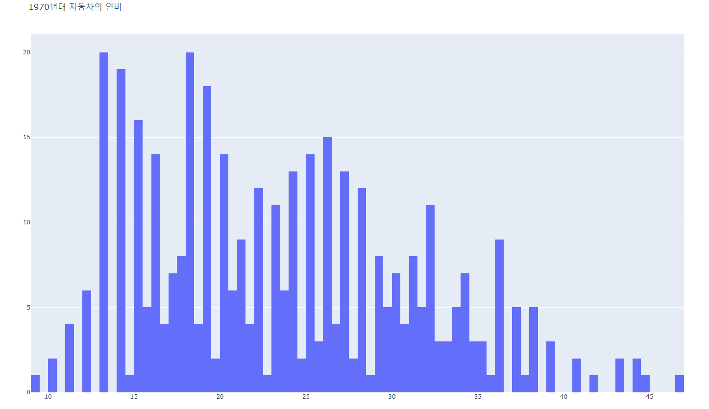
bar chart와의 차이?
bar : 명목형, histo : 연속형
- hist3.py
#######
# This histogram has narrower bins than the previous hist1.py
######
import plotly.offline as pyo
import plotly.graph_objs as go
import pandas as pd

df = pd.read_csv('mpg.csv')

data = [go.Histogram(
    x=df['mpg'],
    xbins=dict(start=8,end=50,size=1),
)]

layout = go.Layout(
    title="Miles per Gallon Frequencies of<br>\
    1970's Era Vehicles"
)
fig = go.Figure(data=data, layout=layout)
pyo.plot(fig, filename='narrow_histogram.html')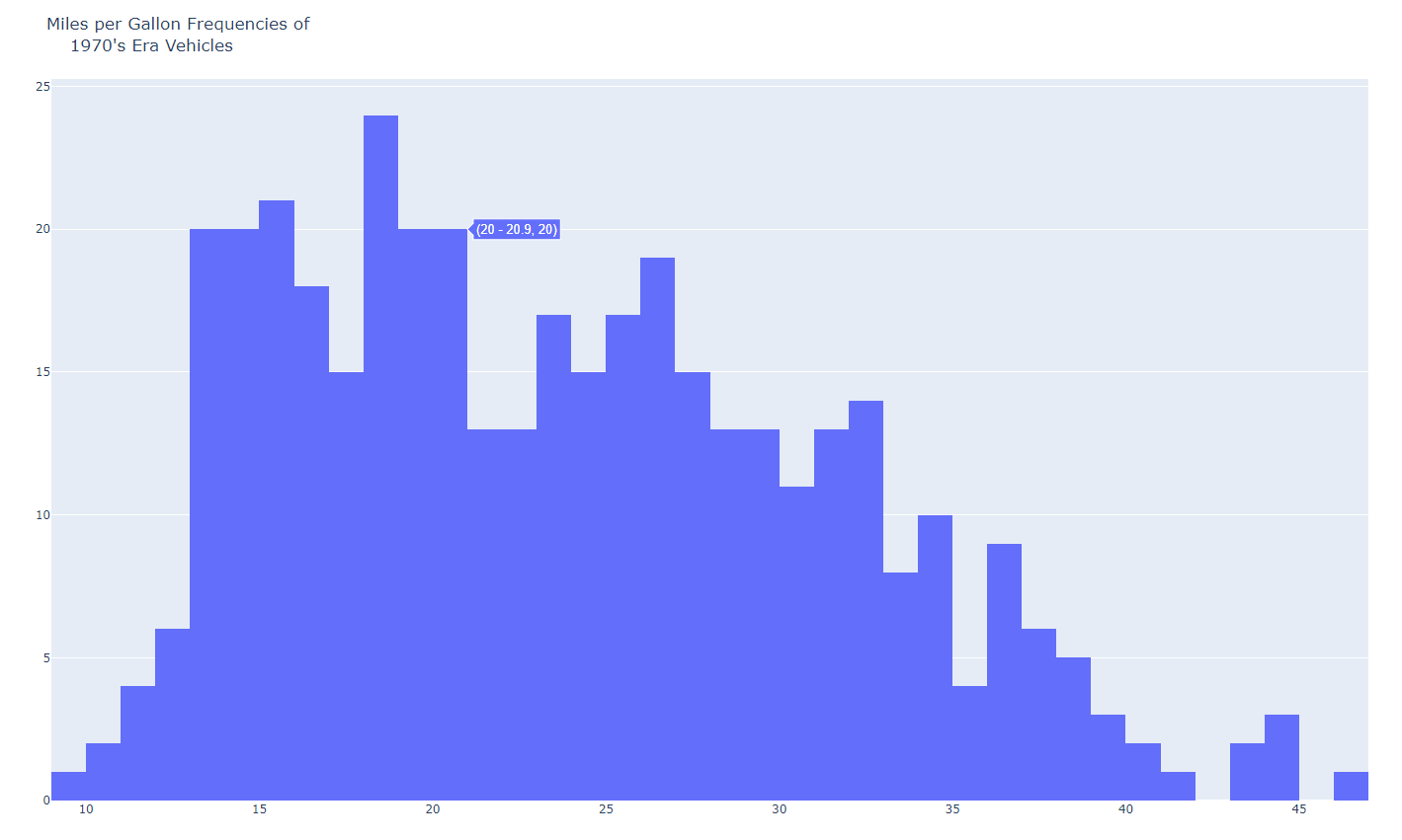
- hist4.py
#######
# This histogram compares heights by gender
######
import plotly.offline as pyo
import plotly.graph_objs as go
import pandas as pd

df = pd.read_csv(r'arrhythmia.csv')

data = [go.Histogram(
    x=df[df['Sex']==0]['Height'],
    opacity=0.5,
    name='Male'
),
go.Histogram(
    x=df[df['Sex']==1]['Height'],
    opacity=0.5,
    name='Female'
)]

layout = go.Layout(
    barmode='overlay',
    title="Height comparison by gender"
)
fig = go.Figure(data=data, layout=layout)
pyo.plot(fig, filename='basic_histogram2.html')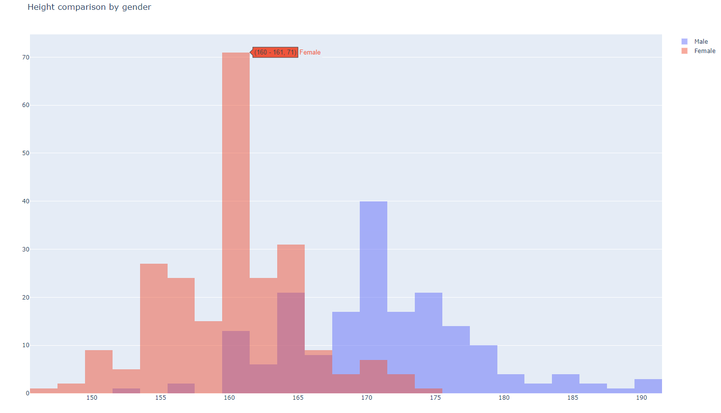
- dist1.py
#######
# This distplot uses plotly's Figure Factory
# module in place of Graph Objects
######
import plotly.offline as pyo
import plotly.figure_factory as ff
import numpy as np

x = np.random.randn(1000)
hist_data = [x]  #list(x)
group_labels = ['distplot']

fig = ff.create_distplot(hist_data, group_labels)
pyo.plot(fig, filename='basic_distplot.html')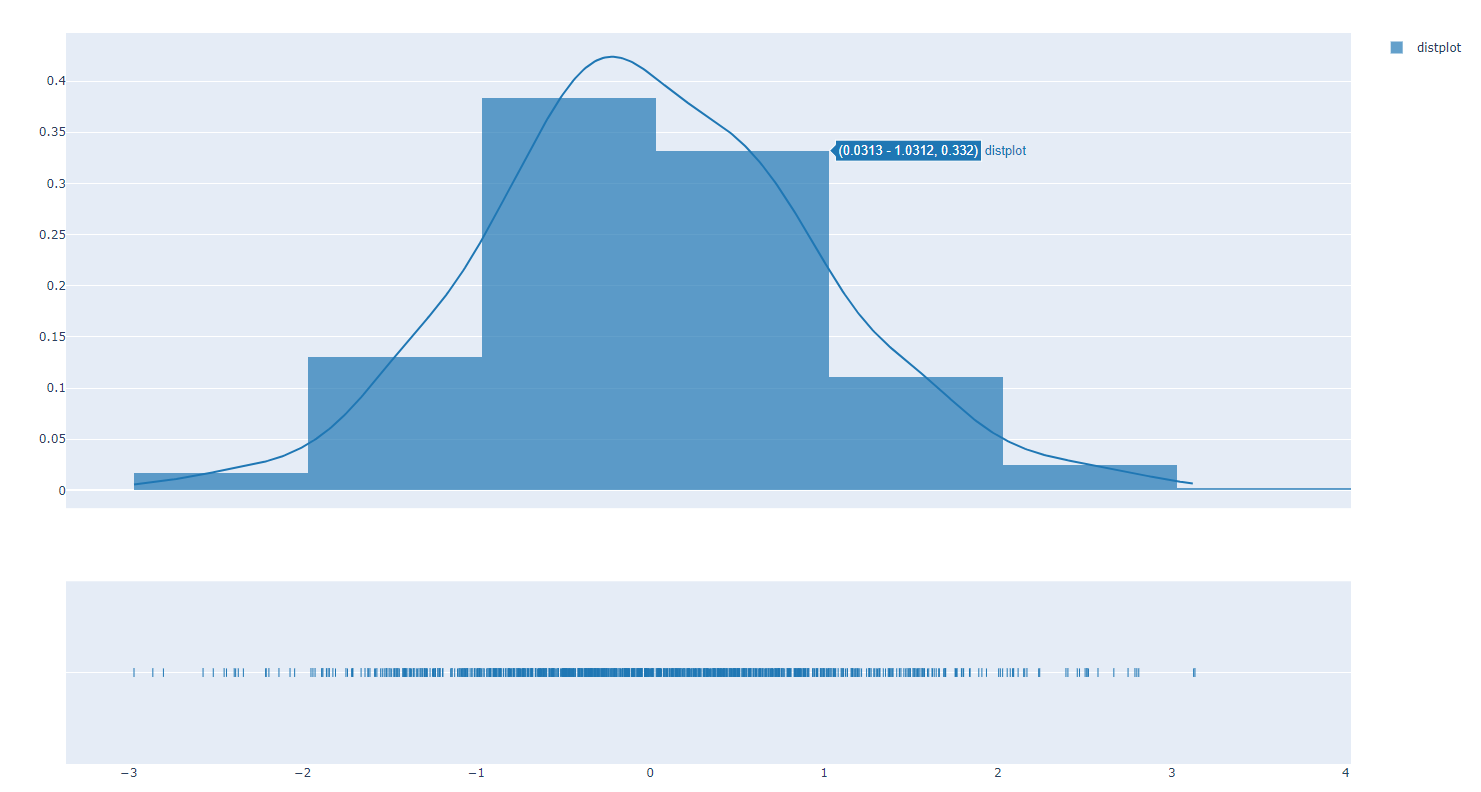
- dist2.py
#######
# This distplot demonstrates that random samples
# seldom fit a "normal" distribution.
######
import plotly.offline as pyo
import plotly.figure_factory as ff
import numpy as np

x1 = np.random.randn(200)-2
x2 = np.random.randn(200)
x3 = np.random.randn(200)+2
x4 = np.random.randn(200)+4

hist_data = [x1,x2,x3,x4]
group_labels = ['Group1','Group2','Group3','Group4']

fig = ff.create_distplot(hist_data, group_labels)
pyo.plot(fig, filename='multiset_distplot.html')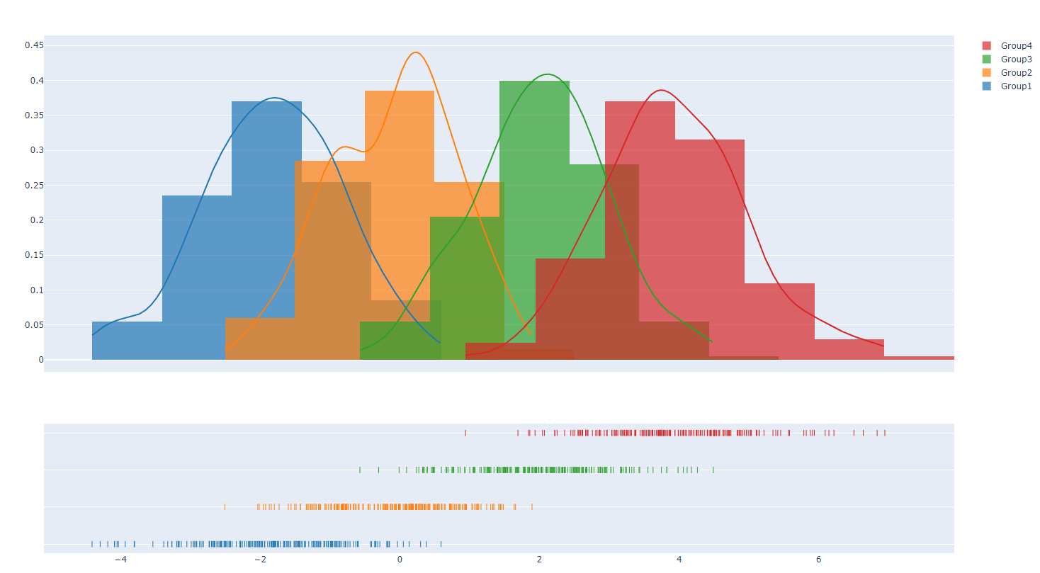
- dist3.py
#######
# This distplot looks back at the Mark Twain/
# Quintus Curtius Snodgrass data and tries
# to compare them.
######
import plotly.offline as pyo
import plotly.figure_factory as ff

snodgrass = [.209,.205,.196,.210,.202,.207,.224,.223,.220,.201]
twain = [.225,.262,.217,.240,.230,.229,.235,.217]

hist_data = [snodgrass,twain]
group_labels = ['Snodgrass','Twain']

fig = ff.create_distplot(hist_data, group_labels, bin_size=[.005,.005])
pyo.plot(fig, filename='SnodgrassTwainDistplot.html')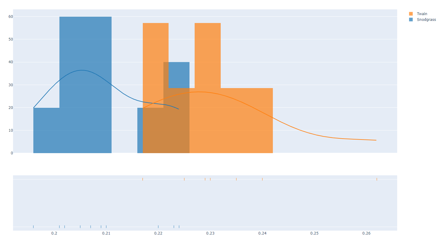
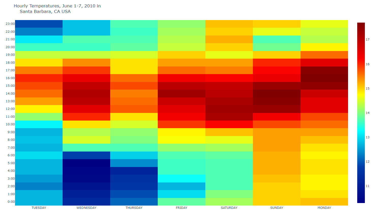
- heat1.py
#######
# Heatmap of temperatures for Santa Barbara, California
######
import plotly.offline as pyo
import plotly.graph_objs as go
import pandas as pd

df = pd.read_csv(r'2010SantaBarbaraCA.csv')

data = [go.Heatmap(
    x=df['DAY'],
    y=df['LST_TIME'],
    z=df['T_HR_AVG'],
    colorscale='Jet'
)]

layout = go.Layout(
    title='Hourly Temperatures, June 1-7, 2010 in<br>\
    Santa Barbara, CA USA'
)
fig = go.Figure(data=data, layout=layout)
pyo.plot(fig, filename='Santa_Barbara.html')
heat map : 열지도, 두 값의 상관의 정도
- heat2.py
#######
# Heatmap of temperatures for Yuma, Arizona
######
import plotly.offline as pyo
import plotly.graph_objs as go
import pandas as pd
df = pd.read_csv(r'2010YumaAZ.csv')

data = [go.Heatmap(
    x=df['DAY'],
    y=df['LST_TIME'],
    z=df['T_HR_AVG'],
    colorscale='Jet'
)]

layout = go.Layout(
    title='Hourly Temperatures, June 1-7, 2010 in<br>\
    Yuma, AZ USA'
)
fig = go.Figure(data=data, layout=layout)
pyo.plot(fig, filename='Yuma.html')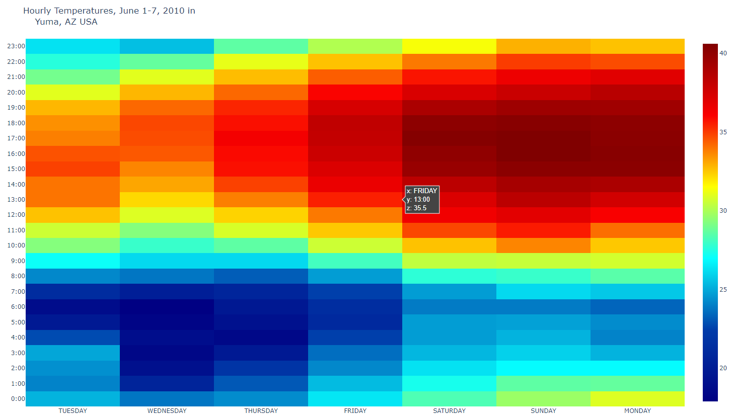
- heat3.py
#######
# Heatmap of temperatures for Sitka, Alaska
######
import plotly.offline as pyo
import plotly.graph_objs as go
import pandas as pd

df = pd.read_csv('2010SitkaAK.csv')

data = [go.Heatmap(
    x=df['DAY'],
    y=df['LST_TIME'],
    z=df['T_HR_AVG'],
    colorscale='Jet'
)]

layout = go.Layout(
    title='Hourly Temperatures, June 1-7, 2010 in<br>\
    Sitka, AK USA'
)
fig = go.Figure(data=data, layout=layout)
pyo.plot(fig, filename='Sitka.html')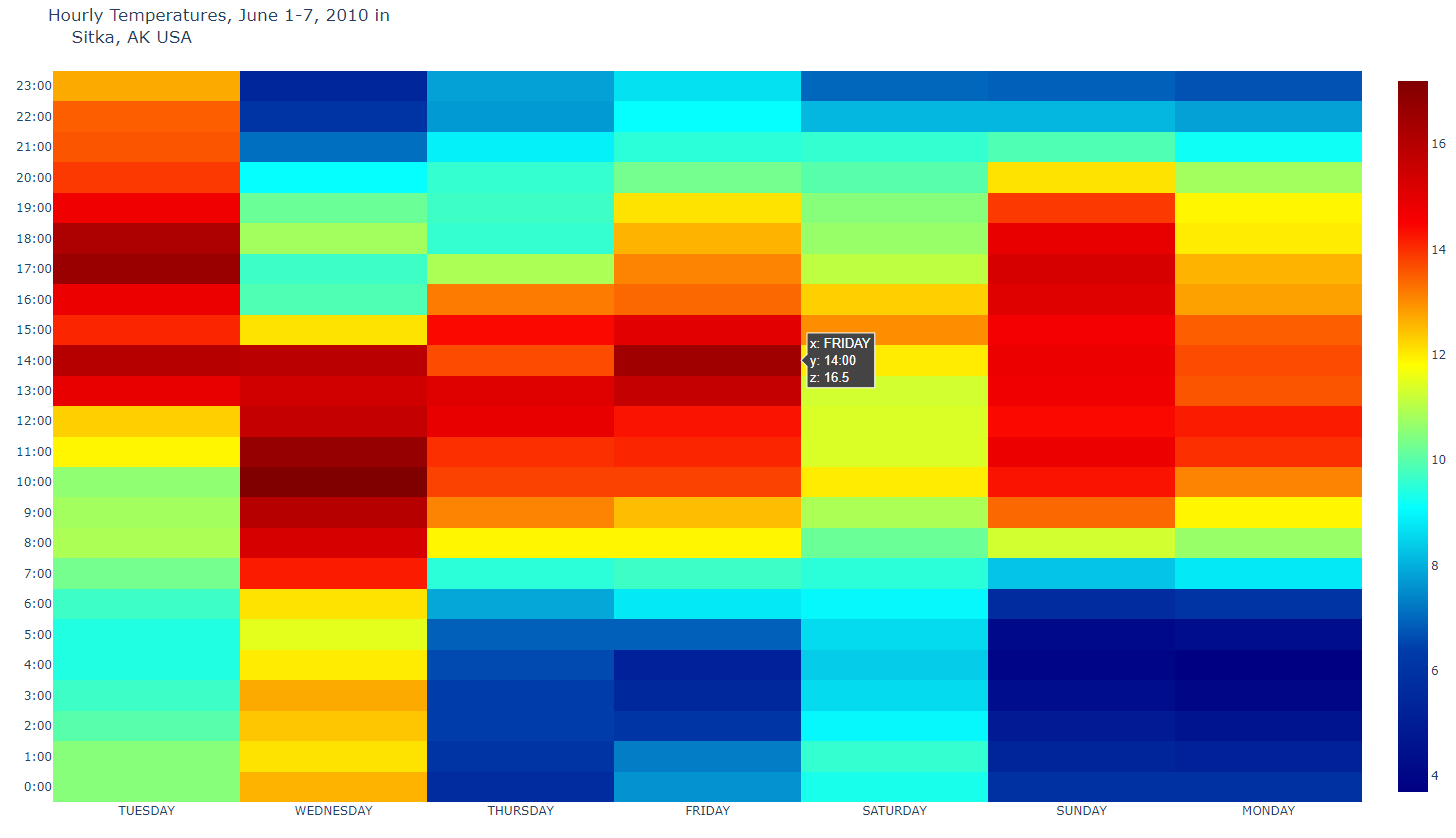
- heat4.py
#######
# Side-by-side heatmaps for Sitka, Alaska,
# Santa Barbara, California and Yuma, Arizona
# using a shared temperature scale.
######
import plotly.offline as pyo
import plotly.graph_objs as go
from plotly import tools
import pandas as pd
df1 = pd.read_csv(r'2010SitkaAK.csv')
df2 = pd.read_csv(r'2010SantaBarbaraCA.csv')
df3 = pd.read_csv(r'2010YumaAZ.csv')

trace1 = go.Heatmap(
    x=df1['DAY'],
    y=df1['LST_TIME'],
    z=df1['T_HR_AVG'],
    colorscale='Jet',
    zmin = 5, zmax = 40 # add max/min color values to make each plot consistent
)
trace2 = go.Heatmap(
    x=df2['DAY'],
    y=df2['LST_TIME'],
    z=df2['T_HR_AVG'],
    colorscale='Jet',
    zmin = 5, zmax = 40
)
trace3 = go.Heatmap(
    x=df3['DAY'],
    y=df3['LST_TIME'],
    z=df3['T_HR_AVG'],
    colorscale='Jet',
    zmin = 5, zmax = 40
)

fig = tools.make_subplots(rows=1, cols=3,
    subplot_titles=('Sitka, AK','Santa Barbara, CA', 'Yuma, AZ'),
    shared_yaxes = True,  # this makes the hours appear only on the left
)
fig.append_trace(trace1, 1, 1)
fig.append_trace(trace2, 1, 2)
fig.append_trace(trace3, 1, 3)

fig['layout'].update(      # access the layout directly!
    title='시간에 따른 온도, June 1-7, 2010'
)
pyo.plot(fig, filename='AllThree.html')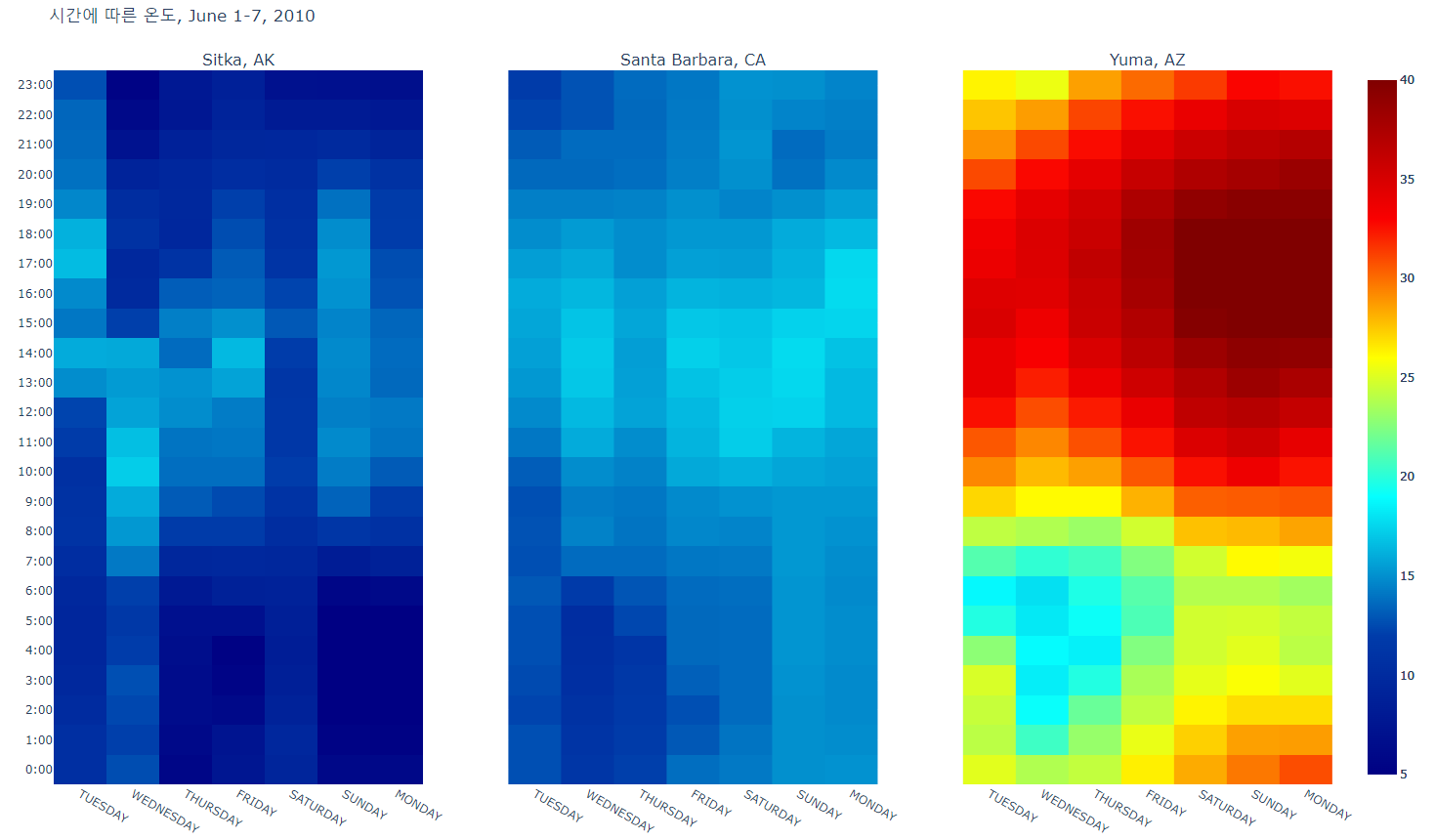
dashboard
- layout1.py
# -*- coding: utf-8 -*-
import dash
import dash_core_components as dcc
import dash_html_components as html
app = dash.Dash()
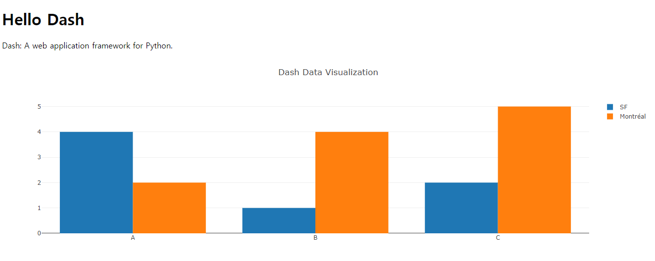
app.layout = html.Div(children=[
html.H1(children='Hello Dash'),
html.Div(children='Dash: A web application framework for Python.'),
dcc.Graph(
id='example-graph',
figure={
'data': [
{'x': ["A", "B", "C"], 'y': [4, 1, 2], 'type': 'bar', 'name': 'SF'},
{'x': ["A", "B", "C"], 'y': [2, 4, 5], 'type': 'bar', 'name': u'Montréal'},
],
'layout': {
'title': 'Dash Data Visualization'
}
}
)
])
if __name__ == '__main__':
app.run_server()http://127.0.0.1:8050/ 에 접속
- layout2.py
# -*- coding: utf-8 -*-
import dash
import dash_core_components as dcc
import dash_html_components as html

app = dash.Dash()

colors = {
    'background': '#111111',
    'text': '#7FDBFF'
}

app.layout = html.Div(children=[
    html.H1(
        children='Hello Dash',
        style={
            'textAlign': 'center',
            'color': colors['text']
        }
    ),

    html.Div(
        children='Dash: A web application framework for Python.',
        style={
            'textAlign': 'center',
            'color': colors['text']
        }
    ),

    dcc.Graph(
        id='example-graph',
        figure={
            'data': [
                {'x': [1, 2, 3], 'y': [4, 1, 2], 'type': 'bar', 'name': 'SF'},
                {'x': [1, 2, 3], 'y': [2, 4, 5], 'type': 'bar', 'name': u'Montréal'},
            ],
            'layout': {
                'plot_bgcolor': colors['background'],
                'paper_bgcolor': colors['background'],
                'font': {
                    'color': colors['text']
                },
                'title': 'Dash Data Visualization'
            }
        }
    )],
    style={'backgroundColor': colors['background']}
)

if __name__ == '__main__':
    app.run_server()
300x250
'CLASS > Spark,Hadoop,Docker,Data Visualization' 카테고리의 다른 글
| [빅데이터분산컴퓨팅] 2022.12.06 liveupdating, lambda, filter, reduce, iter (0) | 2022.12.06 |
|---|---|
| [빅데이터분산컴퓨팅] 2022.11.29 dashboard (0) | 2022.11.29 |
| [빅데이터분산컴퓨팅] 2022.11.08 Categorical Data Ploting, Seaborn, zomata.csv ploting (0) | 2022.11.08 |
| [빅데이터분산컴퓨팅] 2022.11.01 numpy, pandas, seaborn (2) | 2022.11.01 |
| [빅데이터분산컴퓨팅] 2022.10.25 The Ratings Counter, Friends by Age, Filtering RDD's (0) | 2022.10.30 |