# 수치 Data 종류
- 명목
- 순위
- 구간
- 비율
# Seaborn statistical data visualization
엑셀보다 훨씬 발전된 그래프 작성 가능
- Numerical Data Ploting
- Categorical Data Ploting
- Visualizing Distribution of the Data
- Linear Regression and Relation ship
- Controlling Ploted Figure Aesthetics
# seaborn 라이브러리 설치 후 실행
!pip install seaborn
import seaborn as sns
# seaborn 라이브러리의 tips 데이터 plot
sns.set()
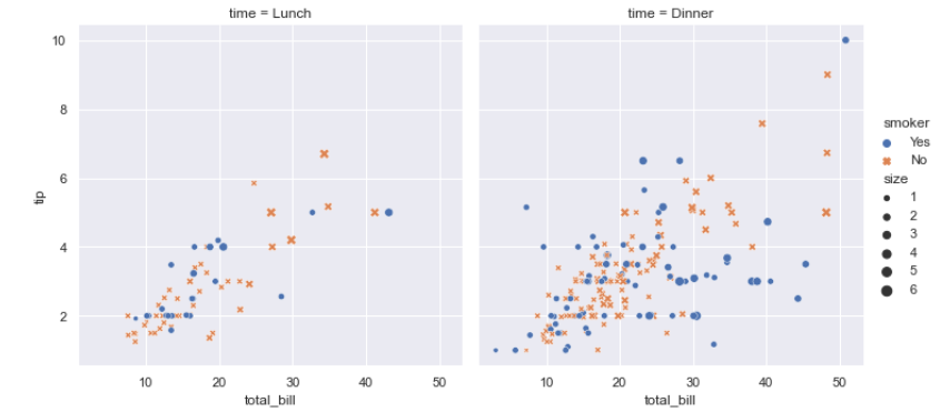
tips = sns.load_dataset("tips")
sns.relplot(x="total_bill", y="tip", col="time",
hue="smoker", style="smoker", size="size",
data=tips);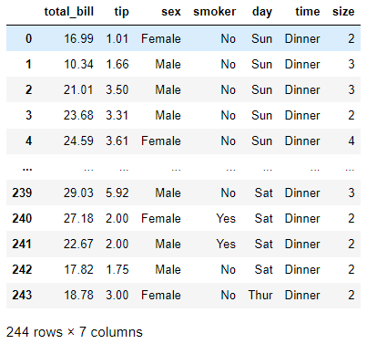
# Specialized Categorical Plots
sns.catplot(x="day", y="total_bill", hue="sex",
            kind="swarm", data=tips);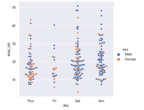
# violin plot
sns.catplot(x="day", y="tip", hue="smoker",
            kind="violin", split=True, data=tips);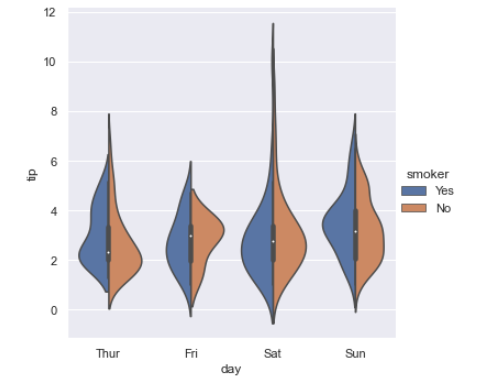
# Ploting with x , y
import pandas as pd
rng = np.random.RandomState(0)
x = np.linspace(0, 10, 500)
y = np.cumsum(rng.rand(500, 6),0)

data = np.random.multivariate_normal([0,0], [[5,2],[2,2]], size=2000)
data = pd.DataFrame(data, columns=['x', 'y'])

data.head()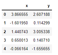
# KD Plot with normal distrubution
for col in 'xy':
    sns.kdeplot(data[col], shade=True)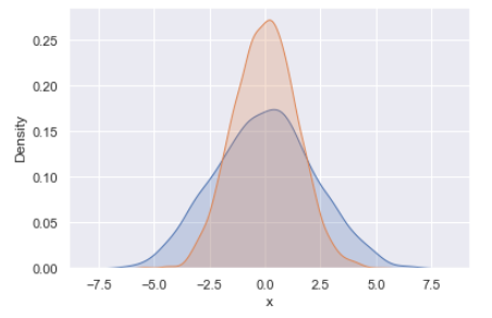
sns.distplot(data['x'])
sns.distplot(data['y'])
with sns.axes_style('white'):
    sns.jointplot("x", "y", data, kind="kde")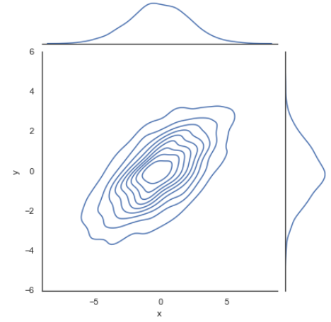
# joint plot using seaborn
with sns.axes_style('white'):
    sns.jointplot("x", "y", data, kind="hex")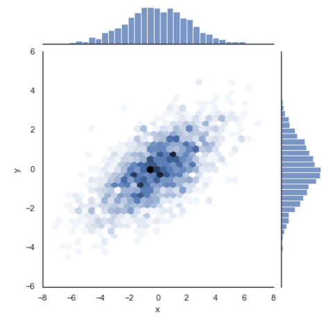
tips = sns.load_dataset('tips')
tips.head()
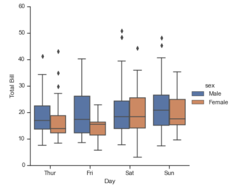
with sns.axes_style(style='ticks'):
g = sns.factorplot("day", "total_bill", "sex", data=tips,kind="box")
g.set_axis_labels("Day","Total Bill");
with sns.axes_style('white'):
sns.jointplot("total_bill", "tip", data=tips, kind="hex")
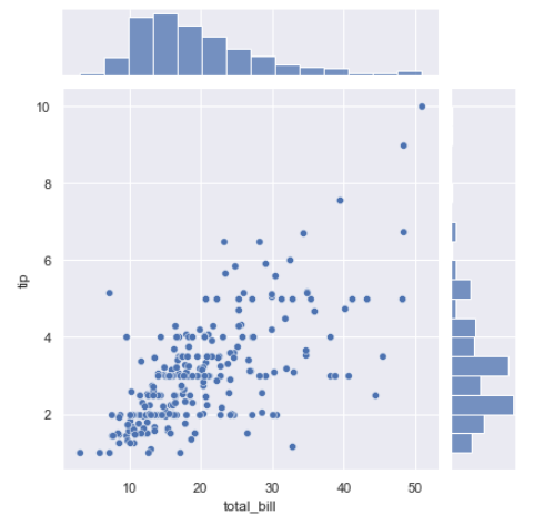
sns.jointplot("total_bill", "tip", data=tips)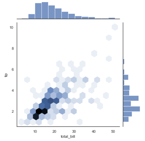
planets = sns.load_dataset("planets")
planets.head()
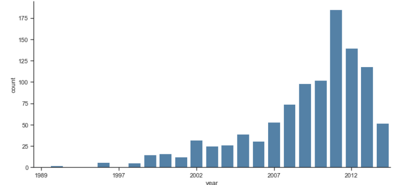
with sns.axes_style(style='ticks'):
g = sns.factorplot("year", data=planets, aspect = 2,kind="count", color="steelblue")
g.set_xticklabels(step=5)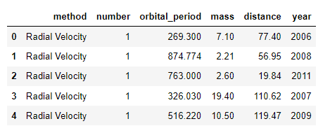
Bengaluru 레스토랑 자료를 이용하여 각 레스토랑의 평균 평점(Rating)의 분포 (Data: Zomato)
5만 건 이상의 자료가 있음
# Columns Description
1. url contains the url of the restaurant in the zomato website
2. address contains the address of the restaurant in Bengaluru
3. name contains the name of the restaurant
4. online_order whether online ordering is available in the restaurant or not
5. book_table table book option available or not
6. rate contains the overall rating of the restaurant out of 5
7. votes contains total number of rating for the restaurant as of the above mentioned date
8. phone contains the phone number of the restaurant
9. location contains the neighborhood in which the restaurant is located
10. rest_type restaurant type
11. dish_liked dishes people liked in the restaurant
12. cuisines food styles, separated by comma
13. approx_cost(for two people) contains the approximate cost for meal for two people
14. reviews_list list of tuples containing reviews for the restaurant, each tuple
15. menu_item contains list of menus available in the restaurant
16. listed_in(type) type of meal
17. listed_in(city) contains the neighborhood in which the restaurant is listed
# import
import pandas as pd
import numpy as np
import matplotlib.pyplot as plt
import seaborn as sns

### so that u dont have warnings
from warnings import filterwarnings
filterwarnings('ignore')
# Read Dataset
df=pd.read_csv('zomato.csv')
df.head()

df.shape

df.dtypes

len(df['name'].unique())

df.isna().sum()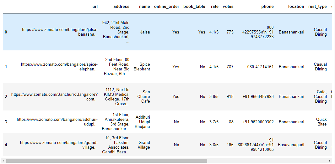
(51717, 17)
url object address object name object online_order object book_table object rate object votes int64 phone object location object rest_type object dish_liked object cuisines object approx_cost(for two people) object reviews_list object menu_item object listed_in(type) object listed_in(city) object dtype: object
8792
url 0 address 0 name 0 online_order 0 book_table 0 rate 7775 votes 0 phone 1208 location 21 rest_type 227 dish_liked 28078 cuisines 45 approx_cost(for two people) 346 reviews_list 0 menu_item 0 listed_in(type) 0 listed_in(city) 0 dtype: int64
# Getting all NAN features
feature_na=[feature for feature in df.columns if df[feature].isnull().sum()>0]
feature_na

for feature in feature_na:
    print('{} has {} % missing values'.format(feature,np.round(df[feature].isnull().sum()/len(df)*100,4)))
['rate',
'phone',
'location',
'rest_type',
'dish_liked',
'cuisines',
'approx_cost(for two people)']
#% of missing values
for feature in feature_na:
    print('{} has {} % missing values'.format(feature,np.round(df[feature].isnull().sum()/len(df)*100,4)))

df['rate'].unique()
rate has 15.0337 % missing values
phone has 2.3358 % missing values
location has 0.0406 % missing values
rest_type has 0.4389 % missing values
dish_liked has 54.2916 % missing values
cuisines has 0.087 % missing values
approx_cost(for two people) has 0.669 % missing values
array(['4.1/5', '3.8/5', '3.7/5', '3.6/5', '4.6/5', '4.0/5', '4.2/5', '3.9/5', '3.1/5', '3.0/5', '3.2/5', '3.3/5', '2.8/5', '4.4/5', '4.3/5', 'NEW', '2.9/5', '3.5/5', nan, '2.6/5', '3.8 /5', '3.4/5', '4.5/5', '2.5/5', '2.7/5', '4.7/5', '2.4/5', '2.2/5', '2.3/5', '3.4 /5', '-', '3.6 /5', '4.8/5', '3.9 /5', '4.2 /5', '4.0 /5', '4.1 /5', '3.7 /5', '3.1 /5', '2.9 /5', '3.3 /5', '2.8 /5', '3.5 /5', '2.7 /5', '2.5 /5', '3.2 /5', '2.6 /5', '4.5 /5', '4.3 /5', '4.4 /5', '4.9/5', '2.1/5', '2.0/5', '1.8/5', '4.6 /5', '4.9 /5', '3.0 /5', '4.8 /5', '2.3 /5', '4.7 /5', '2.4 /5', '2.1 /5', '2.2 /5', '2.0 /5', '1.8 /5'], dtype=object)
# dropna(axis=1)
df.dropna(axis='index',subset=['rate'],inplace=True)
df.shape

def split(x):
    return x.split('/')[0]

df['rate']=df['rate'].apply(split)

df.head()
(43942, 17)
df['rate'].unique()
df.replace('NEW',0,inplace=True)
df.replace('-',0,inplace=True)
df['rate']=df['rate'].astype(float)
df.dtypes
array(['4.1', '3.8', '3.7', '3.6', '4.6', '4.0', '4.2', '3.9', '3.1', '3.0', '3.2', '3.3', '2.8', '4.4', '4.3', 'NEW', '2.9', '3.5', '2.6', '3.8 ', '3.4', '4.5', '2.5', '2.7', '4.7', '2.4', '2.2', '2.3', '3.4 ', '-', '3.6 ', '4.8', '3.9 ', '4.2 ', '4.0 ', '4.1 ', '3.7 ', '3.1 ', '2.9 ', '3.3 ', '2.8 ', '3.5 ', '2.7 ', '2.5 ', '3.2 ', '2.6 ', '4.5 ', '4.3 ', '4.4 ', '4.9', '2.1', '2.0', '1.8', '4.6 ', '4.9 ', '3.0 ', '4.8 ', '2.3 ', '4.7 ', '2.4 ', '2.1 ', '2.2 ', '2.0 ', '1.8 '], dtype=object)
url object address object name object online_order object book_table object rate float64 votes int64 phone object location object rest_type object dish_liked object cuisines object approx_cost(for two people) object reviews_list object menu_item object listed_in(type) object listed_in(city) object dtype: object
# Calculate avg rating of each resturant
df.groupby('name')['rate'].mean().nlargest(10).plot.bar()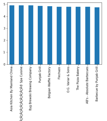
df_rate=df.groupby('name')['rate'].mean().to_frame()
df_rate=df_rate.reset_index()
df_rate.columns=['restaurant','rating']
df_rate.head(20)

df_rate.shape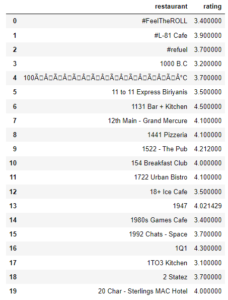
(7162, 2)
sns.set_style(style='ticks')
sns.distplot(df_rate['rating'])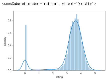
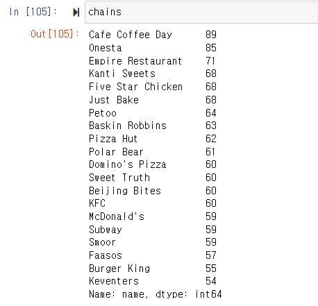
Which are the top restaurant chains in Bangaluru?
plt.figure(figsize=(10,7))
chains=df['name'].value_counts()[0:20]
sns.barplot(x=chains,y=chains.index,palette='deep')
plt.title("Most famous restaurants chains in Bangaluru")
plt.xlabel("Number of outlets")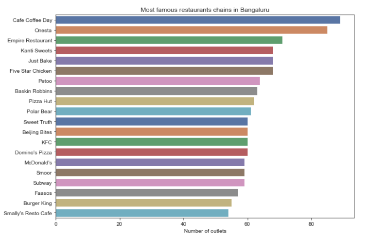
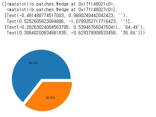
How many of the restuarants do not accept online orders?
x=df['online_order'].value_counts()
x

labels=['accepted','not accepted']
plt.pie(x,explode=[0.0,0.1],autopct='%1.1f%%')
Yes 28308 No 15634
Name: online_order, dtype: int64
location = geolocator.geocode(location) # 위경도
HeatMap(Restaurant_locations[['lat','lon','count']],zoom=20,radius=15).add_to(basemap)
HeatMap : 빈도에 따라 지도에 출력할 때
basemap에 레스토랑의 위치와 카운트 표시
진한 곳에 레스토랑이 밀집되어 있음
from folium.plugins import FastMarkerCluster
FastMarkerCluster(data=Restaurant_locations[['lat','lon','count']].values.tolist()).add_to(basemap)
basemap
지역에 따라 Markercluster 표시됨
HeatMap(rating[['lat','lon','avg_rating']],zoom=20,radius=15).add_to(basemap)
basemap
평점에 따른 HeatMap
# 시험
줌으로, 환경 세팅은 자유, 화면공유, 캠 필수
크게 보면 두문제 pyspark / 데이터주고 그래프?해석?
'CLASS > Spark,Hadoop,Docker,Data Visualization' 카테고리의 다른 글
| [빅데이터분산컴퓨팅] 2022.11.29 dashboard (0) | 2022.11.29 |
|---|---|
| [빅데이터분산컴퓨팅] 2022.11.22 scatter, bar, line, bubble, box plot, histogram, heat map, dashboard layout (0) | 2022.11.22 |
| [빅데이터분산컴퓨팅] 2022.11.01 numpy, pandas, seaborn (2) | 2022.11.01 |
| [빅데이터분산컴퓨팅] 2022.10.25 The Ratings Counter, Friends by Age, Filtering RDD's (0) | 2022.10.30 |
| [빅데이터분산컴퓨팅] 2022.10.18 pyspark word count 예제 (0) | 2022.10.18 |